
Fintan Cadden
AS Media
House style analysis: Q
Q magazine has a consistent house style in the cover page and contents page featuring the red and white colour found in the masthead as well as the same style of fonts, being bold and easily visible, as well as formal. The images are all similar and show the artist as themselves and as it is a hybrid magazine, each band and artist are shown differently.

The main colours presented on the front cover are Red, Blue, White and Black. The texts font are bold and in a serif font for the headline, and a san-serif font on the other text. The band is wearing dark clothing which represents the genre of music they are involved in, rock. Readers could relate to this clothing as they would wear similar things so they are more inclined to buy the magazine. The bolder of the colours featured in the house style (Red and Blue) are used as the headlines and titles, so they stand out more to the reader, making it the first thing they see.

In this contents page, the main colours used are Red, Black, White and blue, this is the same colour scheme presented to the magazine on the front page. This shows how the house style is continued throughout the magazine. The texts font carry on to this page in similarity, as they stay bold, easy to read and also in a san-serif font. Once again, just like the front cover, the bolder colours (Red and Blue) are used as the titles and page numbers, this is because they stand out the most to a reader and they only have to skim through the page to see what they want to.
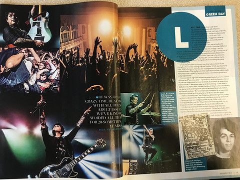
On this double page spread, the main colours shown are White, Blue and black. This follows the house style presented in the magazine earlier. The only colour in the magazine earlier that isn't featured in this page is red. The text is largely similar to what was presented earlier, easy to read and sophisticated, and the colour blue is also used as titles as it is old an standout, but there is less need for this in a double page spread.