
Fintan Cadden
AS Media
Page furniture and design elements
Page furniture is the design elements within a page that make up the design and look of it. These different elements all add up to create a presentable and good looking page
In the feature of KERRANG! I have analysed the front cover features black splodges around the page to draw attention and make the cover more exciting and less blank. These lines and splodges have an un-organised look and are placed randomly in the blank spots of the magazine, the colours follow the house style and so does the randomness of it.
In the Q magazine i have analysed there is a small logo advertising the feature of 'Q review' the logo is clean and adds to page furniture, as it feels a blank gap in the front page, allowing the page to look filled and covered, but not cramped. This is also recognisable so in the next magazine the audience will see this and know what it is


This specific KERRANG! magazine was sold during the week of haloween so to show this and draw in the audience in, they added a small graphic in order to show this. By calling it the 'Massive HAlloween Special' it adds an exciting element to the magazine and can give it individuality compared to its previous editions.

On this edition of KERRANG! to advertise and show an interview inside they created a little graphic with one of the artists from '30 seconds to mars' in a space costume, giving it originality and also allow this to be put into a small section of the front cover whilst still getting the interview shown. This follows the house style as it is red and white, meaning it also fits in with the magazine design.


This image comes from the magazine rocksound and is placed just under the masthead on the right. This is to advertise the reviews within the magazine and to state which 'larger' and well known albums will be reviewed, allowing larger fan bases to be drew in through this , increasing the readership. It is positioned where it is, due to a blank space on the page and the size of it fits perfectly into this.
The Q review, is presented using the logo of the company making it recognisable and joining the houses style which has been presented in the magazine. This is located on the contents page and this title means it fits in with the magazine well as well as standing out. Making this title large, also means you have the ability to fill a large Gap and make the page look for filled.
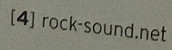
This is the page numbering in the magazine rock sound, it has the numbering then the website, and is situated in the bottom left of the left page, and bottom right of the right page. This is recognisable as it fits with the house style on the first page, as well as the website gives it identity. This allows them to promote the website without having to make an obnoxiously large title, but yet a small set of text which will be seen regularly.

This image appears in a kERRANG! Magazine, and the 'halloween special' in general. This would of been an effect added in editing after and would strike fear into the reader as it resembles a bloody hand print. This adds to the picture on the front cover, in which shows an artist drinking/sucking blood, giving the idea of horror and that vampire resemblance. This handprint is able to take up a blank space which couldn't be filled up by text as its too small of a section. This just adds to the page and makes it look even better and adds to the image.